{
"@type": "Article",
"image": {
"url": "https://csuxjmfbwmkxiegfpljm.supabase.co/storage/v1/object/public/blog-images/organization-10884/1775791608545_Ecommerce-manager-reviewing-dashboard-results.jpeg",
"@type": "ImageObject",
"caption": "Ecommerce manager reviewing dashboard results"
},
"author": {
"url": "https://thinknectar.com",
"name": "Thinknectar",
"@type": "Organization"
},
"@context": "https://schema.org",
"headline": "Ecommerce data visualization: drive smarter decisions",
"publisher": {
"url": "https://thinknectar.com",
"name": "Thinknectar",
"@type": "Organization"
},
"inLanguage": "en-US",
"articleBody": "Learn how data visualization drives faster, smarter e-commerce decisions. Explore key chart types, real-world use cases, and tips to maximize ROI from your data.",
"description": "Learn how data visualization drives faster, smarter e-commerce decisions. Explore key chart types, real-world use cases, and tips to maximize ROI from your data.",
"datePublished": "2026-04-10T03:26:50.015Z"
}
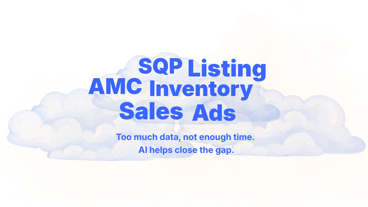
Ecommerce data visualization: drive smarter decisions
.png)

TL;DR:
Effective visualization creates shared understanding and speeds up decision-making across teams.
Choosing appropriate visualization types highlights specific insights, improving actionability and ROI.
Avoid cluttering dashboards, neglecting interactivity, and misaligning visuals with audience needs.
Most e-commerce brand managers are drowning in data but starved for clarity. You have dashboards, reports, and spreadsheets stacking up, yet the decisions that actually move revenue still feel slow and uncertain. The problem is rarely a lack of data. It is a lack of visibility. 3D and interactive visualizations are proven more effective than static reports for analyzing complex e-commerce customer journeys, which means the format of your data matters just as much as the data itself. This guide covers the real business case for visualization, the types that work best, how to turn insights into action, and how to avoid the mistakes that quietly kill ROI.
Key Takeaways
| Point | Details |
|---|---|
| Visualization unlocks insights | Turning complex data into visual stories lets teams find and act on trends much faster. |
| Interactive tools drive ROI | 3D and interactive dashboards improve retention analysis and break down data silos. |
| Avoid common visualization errors | Focus on clarity, audience needs, and practical actions rather than flashy or overloaded charts. |
| Stakeholder engagement is crucial | Making insights accessible for marketing, sales, and ops teams leads to better, faster decisions. |
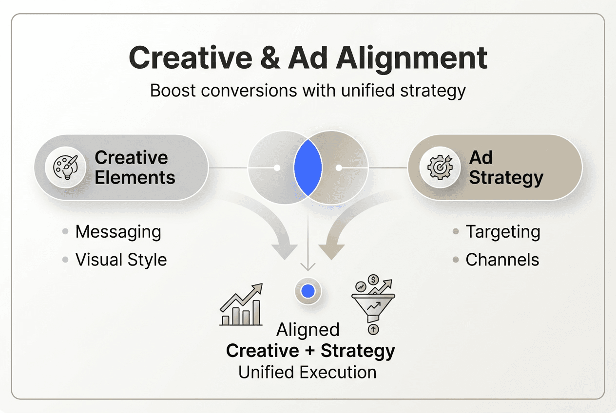
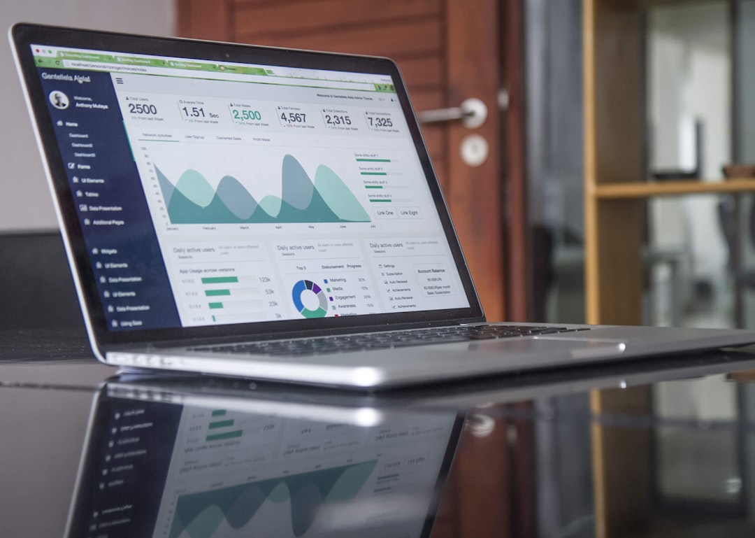
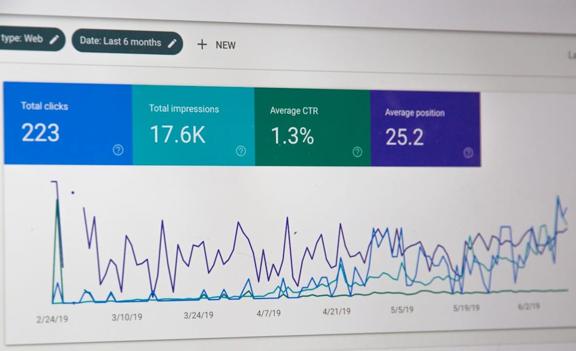
Why visualization, not just analytics, drives results in ecommerce
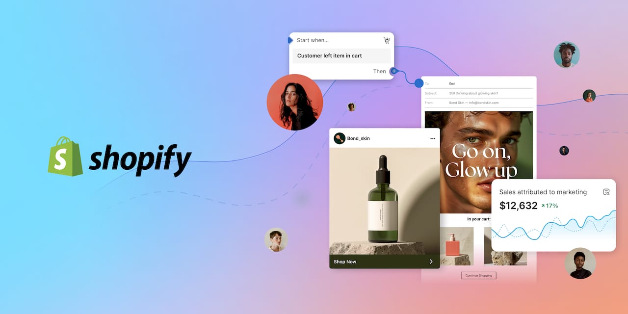
Most mid-sized and enterprise brands have already made significant investments in analytics tools. They track sessions, conversion rates, customer acquisition costs, and return on ad spend. But here is the uncomfortable truth: raw numbers in a spreadsheet do not drive decisions. People do. And people process visual information far faster than rows of figures.
The role of analytics in ecommerce is foundational, but analytics alone is not enough. When your paid media team is looking at one dashboard, your merchandising team is pulling separate reports, and your operations lead is working from a weekly export, you end up with three different stories about the same business. Visualization solves this by creating a shared language across functions.
Here is what effective visualization actually does for your organization:
-
Surfaces trends instantly instead of requiring someone to manually interpret rows of data
-
Aligns cross-functional teams around a single version of the truth
-
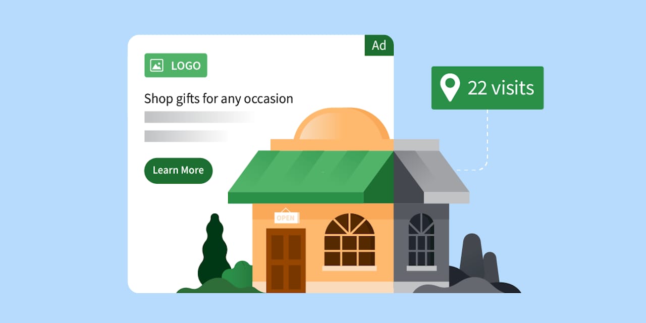
Reduces the lag between insight and action, which is critical in high-velocity channels like Amazon and Shopify
-
Lowers the barrier for non-technical stakeholders to participate in data-driven conversations
“Visualization helps overcome the challenge of siloed data by bringing together cross-functional metrics into a single view, enabling faster and more aligned business decisions.”
Think about what happens when a conversion rate drops 15% on a product detail page. Without visualization, that signal might sit buried in a weekly report until someone notices it days later. With a well-designed dashboard, the anomaly is visible the moment it happens, and your team can respond the same day. That speed advantage compounds over time into a real competitive edge.

Visualization also reduces the risk of misinterpretation. When everyone on your team is reading the same chart rather than their own version of a spreadsheet, you eliminate the “which numbers are right” debate that wastes meeting time and erodes trust in data.
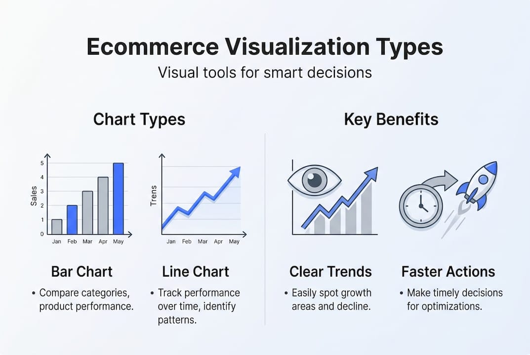
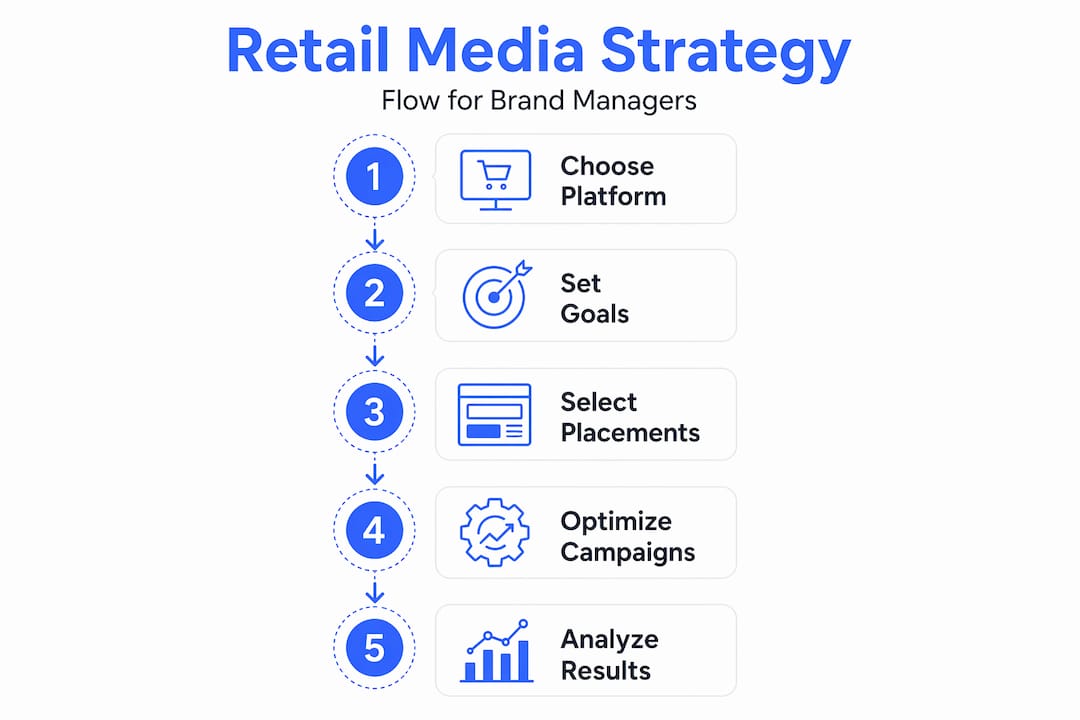
Types of ecommerce data visualizations: Use cases and best practices
Not all visualizations are created equal. Choosing the wrong chart type for your data is like using a map of the wrong city. It looks useful but leads you nowhere. Here are the visualization types that consistently move the needle for e-commerce brands.
| Visualization type | Best use case | Key benefit |
|---|---|---|
| Bar and line charts | Sales trends over time | Easy to spot seasonality and growth patterns |
| Cohort analysis | Retention and repeat purchase behavior | Reveals which customer segments stick around |
| LTV heatmaps | Lifetime value by segment or channel | Prioritizes high-value acquisition sources |
| Funnel visualizations | Conversion flow from browse to purchase | Pinpoints where customers drop off |
| Geo-maps | Regional sales and demand patterns | Informs inventory placement and ad targeting |
Interactive cohort and LTV analysis visualizations are particularly effective for understanding retention and repeat purchase dynamics, which are the metrics that separate sustainable brands from those stuck in constant acquisition mode.
When you leverage ecommerce data through the right visual format, patterns that were previously invisible become obvious. A cohort chart might reveal that customers acquired through a specific promotion have a 40% lower 90-day retention rate than organic buyers. That single insight can reshape your entire acquisition strategy.
Some practical guidelines for choosing and using visualization types:
-
Match the chart type to the question you are trying to answer, not to what looks impressive in a presentation
-
Use interactive filters so stakeholders can explore data without needing a data analyst present
-
Layer in benchmarks or targets directly on the chart so performance context is always visible
-
Avoid mixing too many metrics in one view. Each visualization should answer one clear question
Pro Tip: When building dashboards for executive stakeholders, lead with outcome metrics like revenue and margin at the top, then layer in the diagnostic metrics below. This structure respects their time while still giving them a path to drill deeper.
Tracking the right performance metrics in ecommerce is the prerequisite. Once you know which metrics matter, the visualization layer is what makes them actionable across your organization.
From data to action: How visualization accelerates e-commerce decisions
Visualization is only valuable if it changes what your team does. The real test is whether a chart on a dashboard leads to a faster, better decision than a report in someone’s inbox. In our experience, it almost always does, but only when the visualization is designed with a specific decision in mind.
Here are four scenarios where visualization directly drives high-value decisions:
-
Checkout drop-off detection. A funnel visualization shows a sudden 20% drop between the cart and payment step. Your team identifies a broken promo code field within hours and fixes it before the weekend sale window closes.
-
Ad spend reallocation. A real-time performance dashboard shows that one campaign is generating a 6x return on ad spend while another is at 1.2x. Your media team shifts budget the same day instead of waiting for the weekly report.
-
Retention offer targeting. An LTV heatmap reveals that customers in a specific geographic region have 30% higher lifetime value. Your CRM team creates a tailored retention sequence for that segment.
-
Inventory positioning. A geo-map shows demand spiking in the Southeast two weeks before your national campaign launches. Your operations team adjusts fulfillment center stock before you run out.
Brand managers in mid-sized and enterprise e-commerce use visualization to counteract siloed departmental data, enabling whole-journey optimization that would be impossible with disconnected reports.
Pro Tip: Build a “decision trigger” into your dashboards by setting threshold alerts. When a key metric crosses a defined boundary, the right person gets notified automatically. This turns passive monitoring into active management.
The downstream effect is fewer meetings spent debating what the data says and more time spent on what to do about it. When you analyze ecommerce data for conversions through well-designed visual tools, your test-and-learn cycles accelerate because the feedback loop between action and result becomes much shorter.
Common pitfalls and how to maximize your ecommerce visualization ROI
Even brands that invest seriously in visualization often fail to get full value from it. The most common reason is not a technology problem. It is a design and adoption problem.
Here are the pitfalls that consistently undermine visualization initiatives:
-
Overloading charts with irrelevant data. When a single dashboard tries to show everything, it communicates nothing. Stakeholders disengage, and the tool gets ignored.
-
Ignoring interactivity. Static screenshots of dashboards sent via email remove the ability to explore, filter, and ask follow-up questions. Interactive and 3D visualization supports actionable retention and purchase behavior insights in ways that static reports simply cannot replicate.
-
Neglecting audience needs. A dashboard built for a data analyst is not the right tool for a VP of Marketing. Tailor the view to the decisions each audience needs to make.
-
Measuring the wrong things. Vanity metrics look good in a chart but do not connect to business outcomes. Every visualization should trace back to a revenue or margin lever.
“The most dangerous dashboard is one that feels informative but does not change behavior. If your team looks at a chart and walks away without a clear next step, the visualization has failed its job.”
To maximize ROI from your visualization investments, focus on these best practices:
-
Start with the decision, not the data. Ask what action this visualization should enable before you build it.
-
Run quarterly reviews of your dashboards to retire charts that no one uses and add views that reflect current business priorities.
-
Train non-technical teams on how to read and interact with visual tools. Adoption is the multiplier on any visualization investment.
Pro Tip: Measure visualization ROI by tracking decision velocity. How long does it take from a data signal appearing to a team taking action? If that number is shrinking, your visualization strategy is working. Pair this with data-driven strategies for scaling ecommerce to build a compounding advantage over time.
Why most ecommerce brands underutilize data visualization—and how to break through
Here is what we see consistently: brands invest heavily in analytics platforms, build out data warehouses, and hire analysts, then bolt visualization on at the end as a reporting layer. That sequence is backwards.
Visualization should not be the last step in a data workflow. It should be the interface through which strategy is built. When your weekly business review is structured around live dashboards rather than static slide decks, something shifts. Conversations move from “what happened” to “what should we do next.” That is the mindset difference that separates data leaders from brands that are always playing catch-up.
Brands that empower non-technical teams with accessible visual tools see compounding benefits because more people can participate in data-driven decisions. Your merchandising manager should not need to submit a ticket to your analytics team every time they want to understand how a product is performing by region.
The path to increase ecommerce ROI with data runs directly through making visualization a core business capability, not a reporting afterthought. The brands winning in 2026 are the ones where every team member can look at a dashboard and know exactly what to do next.
Take your ecommerce data visualization even further with Nectar
Ready to translate insights into growth? Nectar’s proprietary iDerive analytics platform is built specifically for mid-sized and enterprise e-commerce brands that need more than generic dashboards.
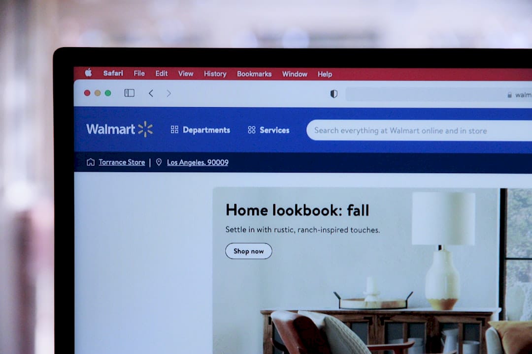
We connect your full-funnel data across Amazon, Walmart, and Shopify into visualization layers designed around the decisions your team actually makes. From Amazon Growth & Optimization to ecommerce creative services that make your data-backed strategy visible to customers, Nectar gives you the infrastructure to act faster and scale smarter. If your current dashboards are not driving decisions, it is time to see what purpose-built visualization looks like for your brand.
Frequently asked questions
What is the primary benefit of data visualization in e-commerce?
Data visualization enables e-commerce teams to interpret large, complex datasets quickly, leading to faster and more effective business decisions. Visualization clarifies multi-channel performance in ways that raw data reports cannot replicate.
Which visualization types are most effective for retention analysis?
Interactive cohort analysis and LTV heatmaps are especially powerful for understanding retention trends in e-commerce. Cohort and LTV visualizations surface repeat purchase dynamics that static reports consistently miss.
How do visualization tools help with cross-team collaboration?
They centralize disparate data into a shared view, making insights accessible for all stakeholders and supporting aligned decision-making. Cross-functional metrics in a single view eliminate the competing narratives that slow down execution.
What are some common pitfalls to avoid in ecommerce data visualization?
Avoid overloading visuals with irrelevant data, neglecting interactivity, and failing to tailor dashboards to the specific audience using them. Overcomplicating visuals and ignoring interactivity reduces actionability and drives disengagement from the tools your team needs most.
Recommended
-
Nectar Blog | How to Leverage Ecommerce Data for Higher ROI in 2026
-
Nectar Blog | How to Analyze Ecommerce Data for Higher Conversion Rates
-
Nectar Blog | How to Increase Ecommerce ROI with Data and Creative
-
Nectar Blog | Performance Metrics in Ecommerce: Driving ROI Growth
-
Role of Data in Manufacturing: Driving Efficiency and Quality


.png)


%20(1).png)