The Role of Design in Product Listings That Convert
.webp)
TL;DR:
- Many e-commerce teams underestimate how weak listing design causes significant revenue loss and cart abandonment. Effective UX, visual hierarchy, and consistency boost discoverability, trust, and conversion, often up to 400%. Proper design strategies are essential business decisions that directly impact sales performance and brand perception.
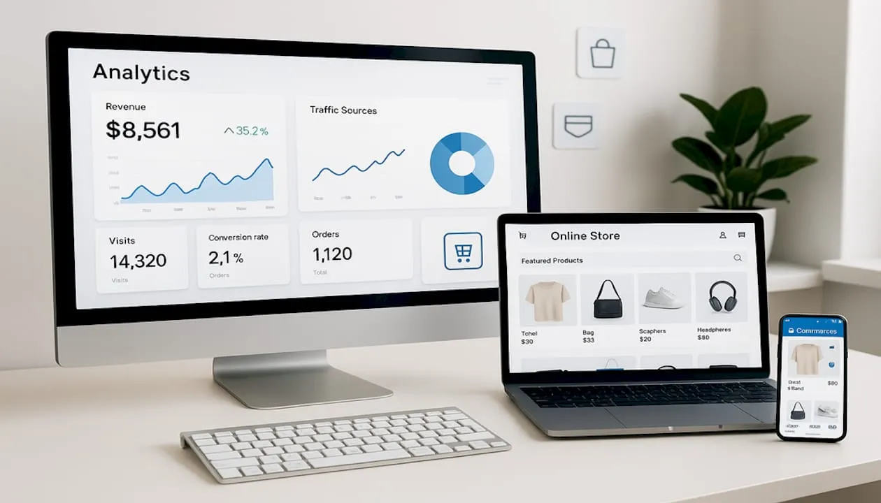
Most e-commerce teams underestimate how much revenue they’re leaving on the table because of weak listing design. With a 70.19% cart abandonment rate recorded in 2024 and up to 400% conversion uplift possible from effective UX improvements, the role of design in product listings is not a creative preference. It’s a business decision with measurable consequences. This article breaks down exactly how visual design, UX structure, and brand consistency translate into discoverability, trust, and sales for mid-market and enterprise brands managing listings at scale.
Key takeaways
| Point | Details |
|---|---|
| Design drives conversion, not just aesthetics | Strong visual structure and UX design can increase conversion rates by up to 400% when applied correctly. |
| Visual hierarchy determines engagement | A well-structured layout increases user engagement by over 40% and prevents costly drop-off. |
| Custom visuals lift organic traffic | Infographics generate an average 110% increase in organic traffic, making them a high-return design investment. |
| Consistency builds brand trust at scale | A Visual Design Language unifies design across large portfolios and reduces the brand fragmentation that costs enterprise brands conversions. |
| Data should drive design iteration | Monitoring CTR and ACoS through automated dashboards lets teams refresh creative before performance degrades. |
The role of design in product listings and visibility
Before a shopper reads a single word of your product description, they’ve already formed an impression. Users form rapid opinions based on visual cues like color, typography, and spacing, and design clarity reduces cognitive overload, which directly increases purchase likelihood. That first visual impression determines whether someone scrolls past or stops to engage.
High-quality imagery is the most immediate signal of product value. For e-commerce listings, this means more than clean backgrounds and accurate color. It means showing context. Lifestyle shots that place a product in a realistic setting communicate utility far more convincingly than isolated white-background photos alone. And the shift away from overly polished photography matters here too. Consumers increasingly favor authentic, relatable visuals over retouched imagery that feels disconnected from reality. Authenticity in your listing photos builds the kind of trust that a high production budget alone cannot manufacture.
Visual hierarchy is the structural layer most brand teams overlook. It refers to how you sequence and weight information across a listing page so the shopper’s eye moves intentionally from headline to image to key benefit to call-to-action. A well-structured visual hierarchy raises user engagement by over 40%, while poor layout design causes nearly 38% of users to disengage entirely. Those aren’t vanity metrics. They represent real shoppers who left without buying because the page failed to guide them.
-
Use size contrast to signal priority: your hero image and product name should dominate, secondary specs should recede
-
Apply whitespace deliberately so each element breathes and doesn’t compete for attention
-
Keep your color palette anchored to two or three brand colors to prevent visual noise
-
Position reviews and trust badges near the primary CTA, where purchase hesitation is highest
Understanding how design affects product visibility also means understanding search. Listings with optimized images, clear thumbnail compositions, and consistent visual branding perform better in both algorithmic ranking and click-through. A thumbnail that reads well at 200 pixels is a design problem as much as an SEO problem.
Pro Tip: Test your product thumbnail at its smallest rendered size across every marketplace where you sell. If the main benefit or product detail isn’t readable at that scale, the image needs to be redesigned before you run any paid traffic to it.
UX design principles that reduce friction and close sales
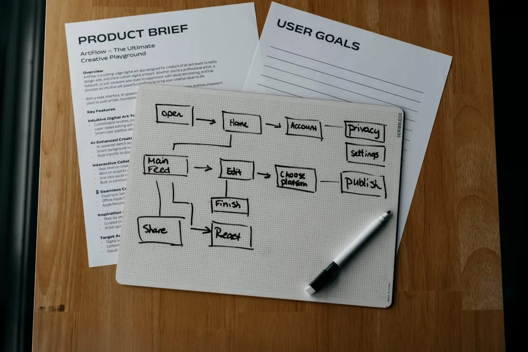
UX and UI are not interchangeable terms, and conflating them is an expensive mistake. UI (user interface) covers what things look like. UX (user experience) covers how they work. A listing can be visually beautiful and still fail because the purchase path is confusing, slow, or full of hidden obstacles. Frictionless UX design minimizes cart abandonment by addressing functionality, not just visual appeal.
The design elements for effective listings that reduce friction follow a clear hierarchy of priorities:
-
Mobile optimization first. More than 60% of e-commerce traffic now comes from mobile devices. If your listing pages aren’t designed for thumb navigation, small screens, and variable connection speeds, you’re designing for a minority of your actual shoppers.
-
Clear, unambiguous calls-to-action. The “Add to Cart” or “Buy Now” button should never compete with surrounding design elements. It should be the most visually prominent interactive element on the page below the fold.
-
Transparent cost display. Unexpected costs at checkout are the leading driver of cart abandonment. Displaying shipping fees and estimated delivery times directly on the listing page removes the shock that kills conversions at the final step.
-
Guest checkout availability. Forcing account creation before purchase adds friction without adding value for first-time buyers. Offer the account option after the purchase is complete.
-
Fast load times. Every additional second of page load time reduces conversions by approximately 7%. Design decisions like uncompressed images and excessive animation have direct revenue consequences.
Pro Tip: Run a friction audit on your top 10 listings by revenue. Map every click a shopper has to make from landing on the page to completing a purchase, then identify which steps could be eliminated or simplified. Most teams find at least two unnecessary friction points they had stopped noticing.
On product detail pages, the essential optimization elements that consistently move the needle are: above-the-fold benefit statements, variant selectors that show real product differences, and trust signals placed near the add-to-cart button. Getting all three right on every listing in a large catalog requires a system, not a one-off redesign effort.

Custom visuals and their impact on organic traffic
Most listing teams think of visuals purely in terms of conversion. The smarter play is to recognize that the right visuals also drive discovery. Custom infographics generate an average 110% increase in organic traffic, and custom featured images improve traffic by 13% on high-traffic pages. Those numbers reflect something important: search engines surface pages that users engage with, and well-designed visual content drives that engagement.
Infographics earn this traffic lift for several reasons. They break down dense product specifications into scannable, shareable formats. They reduce the cognitive load of comparing features. And on marketplaces like Amazon, listing images that function as mini-infographics, with callouts, dimensions, and material comparisons built into the visual, answer questions without requiring the shopper to read dense copy.
-
Prioritize infographic-style images for any product with more than three technical differentiators
-
Use custom comparison graphics when your product sits in a crowded category where shoppers are actively weighing options
-
Design secondary images that address the top five objections your customer service team hears most frequently
-
Avoid investing in custom visual assets for listings on content with declining search demand. The ROI only materializes when traffic volume is sufficient to justify the creative spend.
Creating attractive product images that serve both conversion and SEO requires intentional planning before the shoot, not post-production fixes. Know what information you need to communicate visually before the camera rolls.
Building a Visual Design Language across your catalog
Enterprise brands that have grown through acquisitions or rapid category expansion often carry a hidden liability: design fragmentation. Fifteen product lines with fifteen different visual styles send an inconsistent signal to shoppers about who you are and whether you can be trusted. A Visual Design Language (VDL) solves this.
A VDL is a defined system of design rules that governs how your brand looks across every listing, asset, and touchpoint. It includes typography standards, color palette specifications, image style guidelines, iconography conventions, and layout rules. Implementing a VDL aligns diverse product portfolios and enhances brand trust and perceived professionalism, both of which drive conversion.
For mid-market and enterprise brands, establishing a VDL typically follows four steps:
-
Conduct a design audit. Pull representative samples from every product line and map where the design language breaks down. Identify the inconsistencies that are most visible to shoppers, not just the ones that bother your internal team.
-
Define your core design principles. What should every listing communicate visually? Speed? Safety? Luxury? Accessibility? Your principles should connect directly to your brand positioning and your customers’ purchase motivations.
-
Build a shared asset library. Templates, approved fonts, approved color codes, and approved photographic style guides should live in a centralized system that every team member and agency partner can access.
-
Enforce through governance, not just guidelines. Document who has approval authority for new listing designs and set a review cadence to audit compliance. Guidelines without enforcement drift within six months.
The role of aesthetics in product promotion becomes exponentially more powerful when every product in your catalog sends a cohesive visual message. Consistency is itself a trust signal.
Product card design that actually converts

A product card is the first compressed representation of your listing that most shoppers encounter, whether in search results, category pages, or sponsored placements. It needs to carry enormous informational weight in a very small space. The mistake most teams make is designing cards as individual assets rather than as a system.
Key principles for effective product card design that converts:
-
Surface critical information upfront. Displaying shipping costs and return policies directly on product cards reduces the confusion that leads shoppers to open six tabs and never return to yours.
-
Be selective with quick-add buttons. Quick-add features improve conversions for simple replenishment products, but they can actually increase return rates on complex items where variant selection requires more consideration.
-
Keep your thumbnail composition consistent across the catalog so shoppers scanning a grid can make fast visual comparisons without reorienting to different image styles.
-
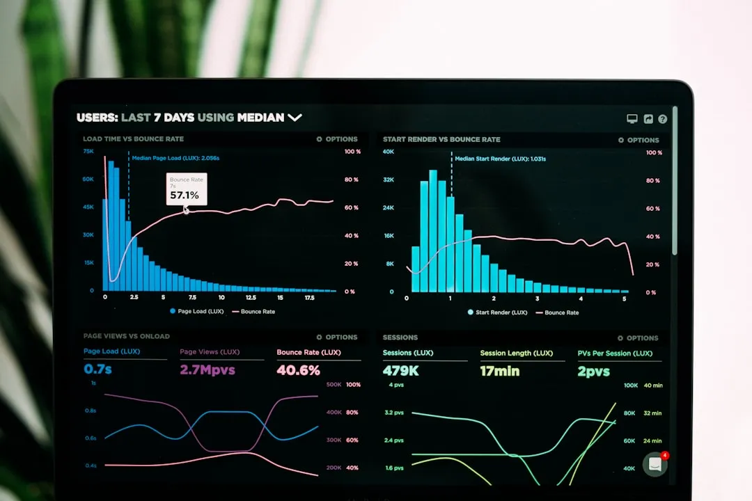
Monitor card performance with automated alerts. Top Amazon sellers use automated dashboards that trigger a creative refresh when CTR drops more than 3%, preventing prolonged underperformance.
Pro Tip: Treat your product card thumbnail as its own design brief, separate from your full listing. Ask one question: does this image communicate who the product is for and what it does within two seconds? If it takes longer, rework the composition before you optimize anything else.
My take: design is your cheapest performance channel
I’ve watched dozens of mid-market brands pour budget into paid search while their listing design quietly destroyed the ROI on every click. The pattern is always the same. Traffic climbs, conversion stays flat, and the instinct is to blame the algorithm or the ad copy. In almost every case, the actual problem was that the page the ad sent shoppers to wasn’t doing its job.
What I’ve found over the years is that treating design as revenue optimization rather than a line-item cost changes how teams make decisions. You stop asking “Can we afford better photography?” and start asking “What is bad photography costing us per month?” That reframe tends to unlock budgets pretty quickly.
The other thing I’d push back on is the assumption that polish equals trust. I’ve seen highly produced listing pages lose to scrappier competitors because the scrappier images looked real. Shoppers have become sophisticated about recognizing stock-style perfection, and it raises doubt rather than confidence. The importance of design in listings is not about spending more. It’s about being more deliberate.
If your catalog is large, start with your top 20% by revenue. Fix the design problems there first. The lift you see will make the business case for the rest of the catalog without you having to argue for it.
— Dan
How Nectar turns listing design into measurable growth
If the design gaps in your listings are costing you conversion at scale, Nectar builds the systems to fix them. From Amazon listing optimization to in-house photography, videography, and full catalog design through Nectar’s Creative Services studio, every engagement is built around what the data says is hurting performance. The proprietary iDerive analytics platform connects design performance metrics directly to revenue outcomes, so you always know which creative changes are worth making and which listings need urgent attention. If you’re managing product listings across Amazon, Walmart, or Shopify and your design output isn’t keeping pace with your growth targets, Nectar has the infrastructure to change that.
FAQ
What is the role of design in product listings?
Design in product listings directly influences visibility, shopper trust, and purchase conversion. It shapes how users perceive product quality and guides them toward a buying decision through visual hierarchy, imagery, and UX structure.
How does visual design affect conversion rates?
Effective UX and visual design can increase e-commerce conversion rates by up to 400%. Poor design contributes to the 70.19% cart abandonment rate recorded in 2024 by creating friction and eroding trust before checkout.
What are the most important design elements for product listings?
High-quality and authentic product images, clear visual hierarchy, mobile-optimized layouts, and transparent pricing information are the design elements that have the most direct impact on listing performance and sales.
How do infographics improve product listing performance?
Custom infographics drive an average 110% increase in organic traffic by improving engagement and page relevance signals. On marketplace listings, they communicate complex product information visually and reduce purchase hesitation.
What is a Visual Design Language and why does it matter?
A Visual Design Language is a defined system of typography, color, imagery, and layout rules applied consistently across all product listings. For enterprise brands, it prevents design fragmentation and builds the brand trust that supports higher conversion rates at scale.
Recommended