Why Optimize for Mobile Shoppers: A 2026 Revenue Guide
.png)

TL;DR:
- Over half of ecommerce traffic now comes from mobile devices, but many brands still prioritize desktop design and testing. Optimizing for mobile speed, user experience, and technical standards is essential for increasing conversions, search visibility, and foot traffic. Implementing mobile-first strategies, streamlining checkout, and leveraging AI-driven personalization can significantly boost revenue and customer loyalty.
More than half of all ecommerce traffic now arrives from a phone, yet most brands still design and test primarily on desktop. That gap costs real money. Understanding why optimize for mobile shoppers matters goes well beyond aesthetics. A page that loads one second too slowly can reduce conversions by 20%, and shoppers who hit friction on mobile rarely come back. This guide breaks down the behavioral science, the technical realities, and the specific strategies that turn mobile visits into purchases.
Key takeaways
Point: Mobile speed is critical Details: A one-second delay drops conversions by 20%, making page speed a direct revenue lever.
Point: Google ranks mobile first Details: Mobile-first indexing means poor mobile performance hurts your search visibility, not just your UX.
Point: Mobile UX requires dedicated effort Details: Thumb navigation, impatience, and scanning behavior mean mobile users need a purpose-built experience.
Point: AI is reshaping mobile shopping Details: Semantic HTML, AI.txt files, and personalized recommendations are now table stakes for mobile discoverability.
Point: Measurement drives improvement Details: Heatmaps, Core Web Vitals, and mobile-specific A/B tests reveal friction that analytics dashboards miss entirely.
Why optimize for mobile shoppers: what the data tells us
Mobile is no longer a secondary channel. It is where your customers live, browse, and increasingly buy. The evidence is hard to ignore.
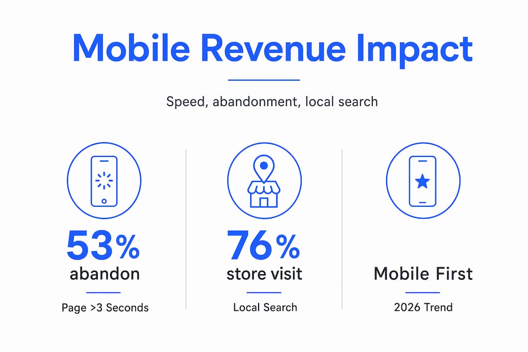
53% of mobile visits are abandoned when a page takes more than three seconds to load. Think about that in dollar terms. If your store generates 50,000 mobile sessions a month and your load time sits at four seconds, you are losing roughly 26,500 potential customers before they see a single product. No ad spend recovers that.
Beyond speed, Google’s mobile-first indexing has been in effect since 2019. This means search rankings reflect the quality of your mobile site, not your desktop version. A beautifully designed desktop storefront paired with a slow, cramped mobile experience can actively suppress your organic visibility. You pay twice: once in lost conversions and again in lost traffic.
Mobile shopper behavior is also categorically different from desktop behavior. Mobile users scan content, expect instant loading, want key information upfront, and navigate entirely with their thumbs. They are often multitasking, moving between apps, checking prices while standing in a physical store. That context demands a different design philosophy entirely.
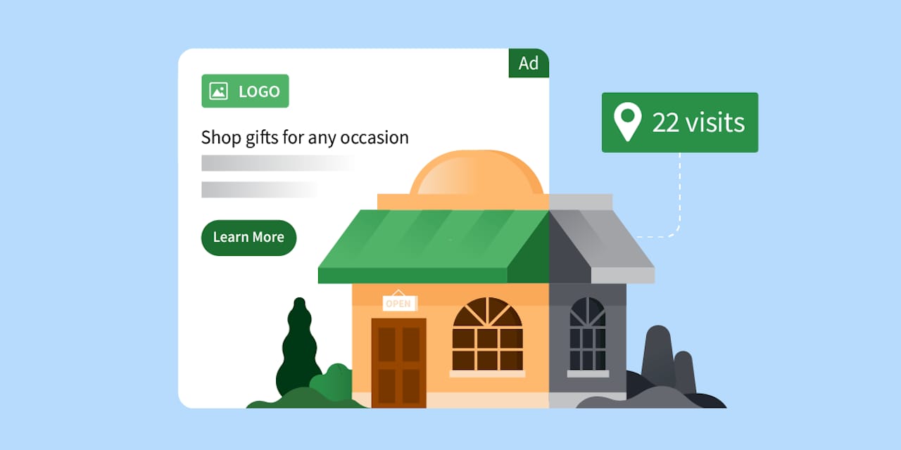
One of the most compelling data points for local and omnichannel brands: 76% of local mobile searches result in a store visit or direct action within 24 hours. Mobile optimization is not just about online conversion. It feeds foot traffic, call volume, and same-day purchases in ways desktop optimization simply cannot replicate.
Pro Tip: Run a quick test right now. Pull up your own store on your phone, on a real device with a normal cell connection, not Wi-Fi. Time how long it takes to get from the homepage to completing a purchase. That experience is what your customers face every day.
Common UX problems that quietly kill mobile sales
Most mobile performance problems are not mysterious. They are predictable, well-documented, and fixable. The issue is that poor mobile UX often goes unnoticed because teams test on desktop and assume the experience translates cleanly.
Here are the friction points most likely to be costing your brand sales right now:
-
Small touch targets. Buttons sized for a mouse cursor are nearly impossible to tap accurately with a thumb. When users miss a button and hit the wrong element, they get frustrated and leave.
-
Long or complicated forms. A checkout form with 12 fields may feel manageable on a keyboard. On a touchscreen, every field is a barrier. Each required tap multiplies the chance of abandonment.
-
Heavy, unoptimized images. Full-resolution product photos built for desktop retina displays can balloon a mobile page to several megabytes. The result is a loading experience that tests patience and loses customers.
-
Poorly placed calls-to-action. CTAs buried below the fold or hidden behind a hamburger menu require too much effort to find. Mobile users will not scroll far to locate what they came for.
-
Desktop-only testing. Many development and QA workflows default to Chrome on a laptop. Real mobile devices behave differently, especially on older hardware or weaker network connections.
Pro Tip: Check your analytics for the specific pages with the highest mobile bounce rates. That list is your prioritized fix-it roadmap. Start there, not with a full redesign.
Best practices for improving mobile shopping experiences
Getting mobile right requires deliberate choices across design, performance, and checkout. Here is what actually moves the needle.
Design for the thumb first
Why mobile-first design works is not complicated. When you design for the smallest, most constrained screen first, every subsequent version of the layout benefits. Place primary navigation within thumb reach in the lower half of the screen. Use minimum 44x44 pixel tap targets for all interactive elements. Keep font sizes at 16px or above to eliminate pinch-to-zoom.
For product pages, show the primary CTA without requiring any scrolling. Test your ecommerce visuals on small screens specifically. A product image that looks crisp on a monitor can appear muddy or cropped on a 375px wide display.
Prioritize speed at every layer
Mobile-first optimization includes compressing images with next-gen formats like WebP, enabling browser caching, and serving assets through a content delivery network. For content-heavy pages, consider Accelerated Mobile Pages to strip out rendering weight.

Target a Largest Contentful Paint under 2.5 seconds and a Cumulative Layout Shift score under 0.1. These are not just technical benchmarks. They are the difference between a visitor who stays and one who bounces to a competitor.
Remove every friction point from checkout
Simplified checkout is one of the highest-ROI changes you can make. Offer guest checkout by default. Integrate digital wallets including Apple Pay and Google Pay so returning customers can complete a purchase in two taps. Auto-fill address fields using the device’s location services. Each step you remove from the checkout flow measurably improves completion rates.
For returning customers, one-click reorder functionality on mobile can dramatically increase lifetime value. The brands winning in Q4 ecommerce consistently invest in mobile checkout as a strategic priority, not an afterthought.
Pro Tip: Offer Apple Pay or Google Pay even if you already have saved payment methods in your checkout. Many mobile users prefer the biometric confirmation of a digital wallet over typing a card number, regardless of the convenience of stored data.
Emerging trends shaping mobile commerce in 2026
The mobile shopping experience is evolving faster than most brands can track. Three developments deserve serious attention from any ecommerce team this year.
-
Agentic engine optimization. AI agents are now browsing, comparing, and recommending products on behalf of users. Brands that use semantic HTML and structured data, and that publish AI.txt files, give these agents cleaner product information to work with. The result is better visibility in AI-assisted discovery channels. This is quickly becoming a new layer of technical SEO, and it matters most on mobile where AI assistants are heavily used.
-
Personalized mobile experiences. AI-driven personalization is reshaping what mobile shoppers expect. Product recommendations that adapt to browsing history, location, and purchase behavior keep users engaged longer and reduce the effort required to find what they want. Brands that deliver relevance at the session level see higher loyalty and conversion rates.
-
Conversational commerce. Chatbots and voice-enabled shopping tools are shortening the path to purchase on mobile. A shopper asking “What running shoes do you have under $120?” and receiving a curated, tappable result in seconds is a fundamentally different experience than filtering a product grid manually. The time-to-purchase reduction that comes from conversational interfaces is measurable, and it primarily benefits mobile users.
For enterprise brands also managing Amazon storefronts, the same principles apply. AI-powered Amazon SEO increasingly rewards structured, semantically rich content, which mirrors the requirements for mobile-first web optimization.
Measuring and iterating on mobile performance
Knowing what to track is as important as knowing what to fix. Mobile conversion rate versus desktop conversion rate is the most telling benchmark you have. If your desktop rate is 3.5% and your mobile rate is 1.1%, you have a quantified revenue gap with a clear direction.
Beyond conversion rates, build a measurement habit around these inputs:
-
Core Web Vitals via Google Search Console, checking LCP, FID, and CLS scores for mobile pages specifically
-
Heatmaps and session recordings, which reveal exactly where mobile users tap, hesitate, and drop off
-
Funnel analysis by device type to identify which step in your checkout flow has the steepest mobile fall-off
-
User feedback collected on mobile, including exit surveys and post-purchase ratings filtered by device
A/B testing on mobile deserves its own program. Changes that lift desktop performance sometimes hurt mobile users, and vice versa. Always segment test results by device. Running a combined test and reading aggregate results hides the mobile-specific signal you need to make good decisions.
Pro Tip: Set up a monthly mobile audit. Open five real sessions from your session recording tool on mobile, watch them without skipping, and write down every moment of friction. This ritual catches regressions that automated tools miss.
My take: mobile optimization is a revenue decision, not a design one
I’ve seen a lot of ecommerce brands pour budget into paid traffic and catalog expansion while their mobile experience quietly bleeds every dollar they spend. The mindset shift that changes everything is treating mobile not as a design consideration but as a revenue strategy.
What I’ve learned working with brands across platforms is that the opportunity is usually hiding in plain sight. Mobile site improvements can double total inquiry volumes from existing traffic by aligning mobile conversion rates with desktop levels. No new ad budget required. That is not a marginal gain. That is a structural business improvement.
The brands that struggle most with mobile are the ones that test it last, budget for it least, and revisit it only when something breaks visibly. Mobile users tolerate almost nothing. They expect speed, clarity, and zero friction, and they carry those expectations from every well-optimized app they use daily. If your store does not feel as fluid as the apps your customers live in, they will spend somewhere that does.
My honest advice: before your next product launch, ad campaign, or platform migration, spend two weeks fixing your mobile experience. Measure what changes. I would be surprised if any other two-week investment in your ecommerce operation outperforms it.
— Dan
How Nectar helps brands win on mobile and beyond

If the strategies above feel like a lot to execute alongside everything else your team is managing, that is exactly the problem Nectar was built to solve. Nectar is a fully managed ecommerce agency that combines data-driven advertising, high-impact creative production, and platform-specific expertise to turn underperforming storefronts into high-converting ones. Whether you are scaling on Shopify, growing your Amazon presence, or trying to make sense of where mobile performance is costing you, Nectar’s team and proprietary iDerive analytics platform give you the granular visibility to act on the right problems first.
Explore Nectar’s ecommerce growth services to see how brands at your scale are improving mobile conversion rates and maximizing long-term ROI. If Amazon is a core channel, the Amazon growth solutions are worth a close look for mobile-first optimization across your listings.
FAQ
Why does mobile optimization matter for ecommerce sales?
53% of mobile visits are abandoned when a page loads in more than three seconds, meaning slow or poorly designed mobile experiences lose sales before they start. Mobile optimization directly increases conversion rates and reduces abandonment.
How does mobile-first design differ from responsive design?
Mobile-first design starts with the smallest screen and scales up, while responsive design adapts a desktop layout downward. Mobile-first produces cleaner, faster experiences for mobile users because constraints are addressed from the beginning rather than patched in later.
What metrics should I track to measure mobile performance?
Track mobile conversion rate versus desktop conversion rate, Core Web Vitals scores for mobile pages, and funnel drop-off by device type. Heatmaps and session recordings add behavioral context that quantitative data alone cannot provide.
Does mobile optimization affect Google search rankings?
Yes. Google’s mobile-first indexing means your mobile site quality determines your search ranking. A poor mobile experience can suppress organic visibility even when your desktop site performs well.
What is the fastest win for improving mobile conversions?
Adding Apple Pay or Google Pay to your mobile checkout is typically the highest-impact, lowest-effort change available. Digital wallets and simplified checkout reduce the steps to purchase and remove the friction of typing card details on a small screen.
Recommended


.png)


%20(1).png)


