Put your buy box, the block containing your product title, image, price, and Add to Cart button, entirely within the first screen a visitor sees, before anything else. That single move matters more than any other layout decision on a Shopify product detail page (PDP).
Here’s why it comes first. Nielsen Norman Group’s eye-tracking research found that users concentrate roughly 80.3% of their viewing time above the fold. If your headline, image, price, and call-to-action don’t fit in that space, most visitors never see them arranged the way you intended.
A converting buy box needs four things stacked in order:
Statistic to remember: with 80.3% of attention concentrated above the fold, every second the buy box hides below it is a second most shoppers won’t wait for.
To apply this in Shopify, open your theme editor and check whether your current product template puts all four elements in the first viewport on mobile. If it doesn’t, create an alternate product template and rearrange the sections rather than fighting your default layout.
Key Takeaways
The highest-leverage move on any Shopify product page is building a complete buy box, title, image, price, CTA, and one trust cue, entirely within the first mobile viewport.
PointDetailsBuy box above the foldPlace title, image, price, CTA, and one trust cue in the first viewport since roughly 80.3% of attention stays there.Match layout to product typeUse visual-first for apparel and home goods, trust-heavy for consumables, minimal commerce for simple SKUs.Design mobile-firstStart from a 390px viewport, use 4:5 image ratios, and keep tap targets at a minimum of 48 pixels.Test one KPI at a timeTrack add-to-cart rate as the primary metric with AOV and return rate as guardrails during layout tests.Consider managed executionNectar pairs Shopify design and development with creative production and iDerive analytics for merchants who prefer a hands-off rebuild.
What Makes a Good Shopify Product Page Layout?
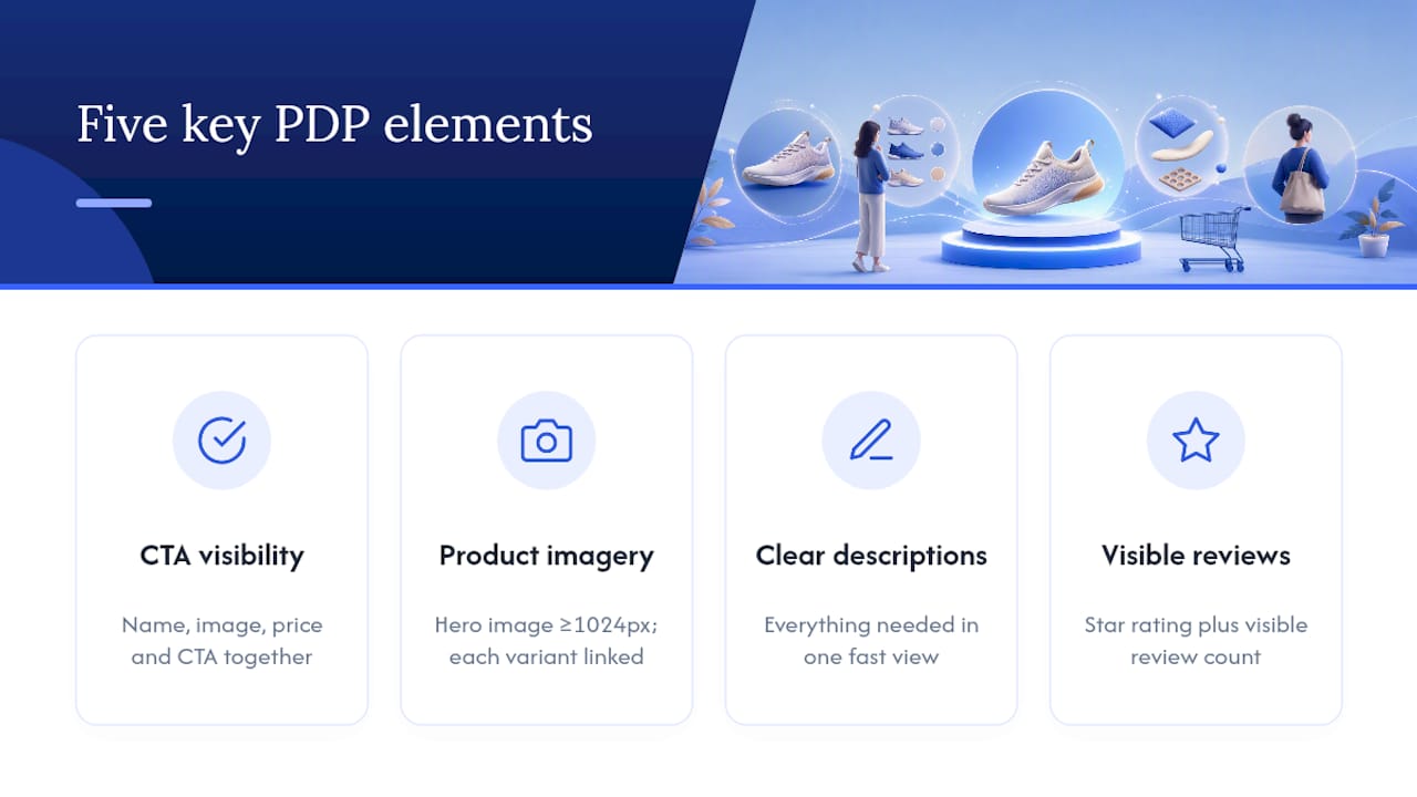
A good Shopify product page layout gives shoppers everything they need to decide inside a single, fast-loading view, then backs that decision with proof lower on the page. Shopify’s own guidance on product page optimization narrows this down to five recurring elements: CTA visibility, product imagery, clear descriptions, visible reviews, and mobile usability. Every one of those shows up in the checklist below, and every one has a specific job to do.
1. The buy box and its decision window
Shoppers give a PDP roughly a few seconds to answer “is this the right product, at the right price, for me?” before they either add to cart or bounce. The buy box exists to answer that question fast: name, image, price, and CTA together, with nothing competing for attention around them.
2. Image and media requirements
Your hero image should load first and load sharp, ideally a minimum of 1024 pixels wide so zoom doesn’t pixelate. Every color or size variant needs its own linked image; a shopper who taps “Sand” should see sand, not the default blue photo still sitting there. If you sell anything with visible texture, material, or fit, that variant linking isn’t optional polish; it’s the difference between a shopper trusting the product and closing the tab.
3. Variant selector UX
Preselect the most popular or lowest-priced variant by default rather than forcing a blank state. Swatches beat dropdowns for color, and size charts should sit inline, not behind a separate page.
4. Price, offers, and policy summary
Show the price your shopper will actually pay, with any discount or bundle math done for them. A one-line shipping and returns summary directly under the price (free shipping over $50, 30-day returns) removes a common reason shoppers abandon a cart to go check policy pages elsewhere.
5. Trust cues near the decision point
A star rating with a visible review count belongs right under the product title, not buried at the bottom of the page. One curated pull quote or testimonial next to the CTA does more persuasive work than a full review widget shoppers have to scroll to find. Reserve third-party certification badges (organic, dermatologist-tested, safety-certified) for categories where shoppers actually look for them, like supplements, skincare, or children’s products.
Run through this list on any live PDP and you’ll usually find one or two elements missing entirely, not misplaced. That’s the easiest fix to make first.
Which Layout Pattern Fits Your Product Catalog?
Not every product needs the same PDP structure, and copying a generic template regardless of what you sell is one of the fastest ways to waste a redesign.
Visual-first layout. Apparel, home goods, and furniture sell on how they look in context. This pattern uses a large hero image or full-bleed gallery, swipeable lifestyle shots, and minimal text competing for attention near the top. The visual identity guidance for fashion brands makes a similar case: when the product’s visual appeal is the primary driver, the layout should get out of the way and let imagery lead.

Trust-heavy layout. Consumables, supplements, and wellness products sell on credibility more than looks. Compress the hero (smaller image, tighter copy) and move certifications, third-party seals, and a review snippet into the first viewport instead of pushing them below the fold.
Minimal commerce layout. Simple, single-variant SKUs, phone cases, basic accessories, replacement parts, don’t need six lifestyle images and a benefits carousel. A stripped hero, one clear CTA, and a lightweight gallery load faster and convert just as well, sometimes better, because there’s less for the shopper to process.
Subscription and bundle-focused layout. If you sell consumables on a subscribe-and-save model, anchor the price comparison directly in the hero: one-time price next to subscription price, with the savings math already done. Flag your best-selling SKU as “most popular” so indecisive shoppers have a default.
Shopify makes all four patterns achievable without custom development. Alternate templates let you assign a different layout to different product types, and metafields let you pull in dynamic data (certifications, subscription pricing, size charts) without hardcoding it into the theme.
Pro Tip: Use app blocks sparingly. Every third-party app section you add to a product template is another script loading on the page. Two or three well-chosen apps beat eight loosely justified ones.
How Should the Hero Section Be Structured on Mobile?
Order matters more than most merchants assume. On a mobile-first viewport, the sequence should run: a one-line headline that states the outcome, the primary image, price and any active offers, a trust cue, then one CTA. Nothing above the CTA should exist purely for decoration.

Operator guidance from D2C Times’ 2026 PDP playbook argues that compressing this entire decision into the first roughly 800 pixels of scroll produces measurably better checkout-entry rates than layouts that spread the same information across two or three screens.
Media stack. Lead with a static hero image for speed, since a shopper’s first impression shouldn’t wait on video buffering. A muted, autoplay video as the second slide works well for demonstrating fit or motion once the page has already loaded. Serve images in WebP or AVIF where your theme supports it, and default to a vertical, 4:5 aspect ratio; most of your traffic is holding the phone upright.
CTA rules. One Add to Cart button, in a color that doesn’t appear anywhere else on the page, sized for an easy thumb tap. Microcopy under the button (“Ships in 2 days” or “Free returns”) answers a hesitation without adding a second button that splits attention.
Price anchoring. If you sell bundles or subscriptions, show both price options inline in the hero rather than making shoppers click through to compare. Label your best-margin or best-converting option “most popular” so shoppers have a reasonable default instead of decision paralysis.
Statistic worth repeating: since roughly 80.3% of attention concentrates above the fold, every element you place in that first 800 pixels gets seen by nearly every visitor. Everything below it gets seen by a shrinking fraction.
Pro Tip: Test your hero on a 390px-wide screen before anything else. That’s the effective width of most iPhone models in portrait mode, and it’s usually the size your theme’s desktop preview never shows you.
Where Should Trust Signals Go on the Page?
Trust signals work best close to the decision, not scattered across the page as filler. Placement changes how persuasive the same piece of proof actually is.
Put the star rating and review count directly under the product title. Shoppers scan for it instinctively, and its absence reads as a red flag even for a genuinely good product. Show raw counts when the number is strong (“4.8 stars, 1,240 reviews”) and aggregate language (“Rated excellent by thousands of customers”) when volume is still building.
One curated quote next to the CTA button often outperforms a full review carousel placed lower on the page. The insight from D2C Times’ PDP research is that front-loading a single piece of specific, credible proof beats front-loading more product features, because it answers the shopper’s actual objection instead of restating what the product already claims to do.
“Does this actually work for someone like me?” is the real question most shoppers are silently asking at the CTA. A single named reviewer with a specific result answers it faster than five feature bullets ever will.
Certification badges (organic, cruelty-free, third-party lab-tested) earn their space in categories where safety or purity claims matter, supplements, skincare, baby products, but they clutter a simple hardware or apparel page where nobody’s looking for them.
That last point matters more than it looks. Practitioner research on scaling DTC product pages found that surfacing shipping and returns terms inline, rather than requiring a click to a policy page, measurably reduces cart abandonment tied to unanswered logistics questions.
What Belongs Below the Fold on a Product Page?
The lower half of your PDP isn’t dead space. Structured correctly, it does two jobs the buy box can’t: it builds long-term customer value, and it heads off returns before they happen.
Curated UGC in particular tends to extend session time and lift conversion because it lets shoppers see the product in real contexts your studio photography can’t fully replicate, according to the same DTC scaling research cited above.
How Do You Design a Product Page for Mobile Performance?
Most of your traffic is on a phone, so design decisions made for desktop and shrunk down will always underperform decisions made for mobile first. Fudge.ai’s PDP anatomy research recommends starting from a 390px viewport and expanding outward, not the reverse.
Statistic to act on: with roughly 80.3% of attention concentrated above the fold, a slow-loading hero image on mobile isn’t a minor performance issue. It’s the single most expensive delay on the entire page.
How Often Should You Test Your Product Page Layout?
Pick one primary KPI per test, usually Add-to-Cart rate or the rate at which shoppers initiate checkout from the PDP, and hold guardrail metrics (average order value, return rate) steady so a layout win doesn’t quietly create a margin problem.
A layered cadence works better than testing everything at once:
This sequencing matches the practitioner logic behind structured PDP testing programs: isolate one variable long enough to trust the result before moving to the next.
Track PDP conversion rate by device and traffic source, the gap between add-to-cart and checkout initiation, and scroll depth at the 50% mark. A Reddit thread among Shopify merchants running their own A/B tests makes the same point independently: pick a single KPI and stop chasing every metric that moves, or you’ll optimize for noise. Pair the numbers with qualitative signals, session recordings, five-second first-impression tests, and a short on-page micro-survey, to understand why a number moved, not just that it did. Nectar’s own breakdown of ecommerce A/B testing covers how to structure this cadence without cannibalizing traffic across simultaneous tests.
How Do You Audit an Underperforming Product Page?
Start with three numbers: scroll depth at 50%, your add-to-cart rate, and the gap between add-to-cart and checkout initiation. Diagnostic guidance from D2C Times’ PDP research offers a useful rule of thumb: if mobile add-to-cart sits under 6%, the problem usually lives above the fold. If the gap between add-to-cart and checkout exceeds 30%, trust and friction lower on the page are more likely culprits.
Run this checklist before touching anything else:
Nectar approaches this exact audit for mid-market and enterprise brands, pairing Shopify site design and development with in-house creative production and its proprietary iDerive analytics platform to find where a page is actually leaking conversions rather than guessing.
Pro Tip: If your add-to-cart rate looks fine but your checkout-initiation rate is weak, don’t touch the hero. The problem is almost always trust or friction further down, not the first screen.
Accessibility Best Practices for Product Page Layouts
An accessible product page isn’t a compliance checkbox; it’s a wider funnel. Shoppers using screen readers, keyboard navigation, or magnification tools abandon poorly built pages just as fast as anyone else, and most PDP accessibility failures come from a short, fixable list.
Every product image needs real alt text describing the product, not the filename or a generic placeholder. Color contrast between your CTA button and its background needs to meet at least a 4.5:1 ratio so shoppers with low vision can actually see the button, not just infer where it should be. Variant swatches need a text label alongside the color swatch itself; color alone excludes shoppers with color blindness from choosing correctly.
Every interactive element, the Add to Cart button, size selector, quantity stepper, needs to be reachable and operable by keyboard alone, not just by mouse or touch. Test this by unplugging your mouse and tabbing through the entire buy box. If focus jumps somewhere unexpected or skips the CTA entirely, that’s a real barrier, not a theoretical one.
Form labels on size charts or custom fields need to be programmatically associated with their inputs, not just visually placed nearby. Screen readers rely on that association, not proximity. Video content in your hero media stack needs captions if it includes spoken narration, and autoplay video should always default to muted so it doesn’t hijack audio unexpectedly.
None of this requires custom development in most cases. Shopify’s built-in theme accessibility features cover a meaningful share of this list already; the remaining gaps usually come from custom sections or third-party app blocks added without review.
How Do Reviews and Upsell Apps Fit Into a Product Page?
Most Shopify merchants aren’t building review displays or upsell logic from scratch; they’re integrating apps into the product template, and how those apps get placed matters as much as which apps get chosen.
Review apps should feed the rating and count directly into the space under your product title, not just populate a separate review section lower on the page. If your app can pull a single high-rated review into the hero automatically, use that feature instead of manually curating one quote and letting it go stale.
Upsell and cross-sell apps work best placed in the below-the-fold “complete the set” module rather than as a popup or interstitial that interrupts the add-to-cart flow. An upsell that appears after a shopper has already committed to buying converts better than one competing with the primary CTA for attention.
Be deliberate about how many app blocks you add to a single product template. Each one is another script loading on the page, and stacking five or six review, quiz, upsell, and countdown-timer apps on the same PDP is a common, quiet cause of slow load times that nobody traces back to the actual culprit. Shopify’s developer guidance on templates and blocks recommends building metafield-aware blocks where possible, pulling dynamic product data directly rather than layering on another app just to display something your store’s data already contains.
Test app-driven changes the same way you’d test a manual layout change: one KPI, one variable, a defined duration, not a permanent addition based on a vendor’s demo.
How Do You Customize Product Pages for International Shoppers?
A product page built for one currency and one language quietly taxes every international shopper with extra friction, and that friction shows up as abandoned carts you never get an explanation for.
Currency should adjust automatically based on the shopper’s location or a visible selector they control themselves, and the displayed price should be the number they’ll actually be charged, not a rough conversion that gets corrected at checkout. Mismatched currency between the PDP and checkout is one of the more common reasons international carts get abandoned right at the finish line.
Shipping and returns language needs to reflect the shopper’s actual country, not a generic US-centric line that doesn’t apply. If your 30-day returns policy only applies domestically, say so, rather than letting an international shopper discover the exception after they’ve already ordered.
Size charts need localized units. A US-only sizing chart forces overseas shoppers to do a mental conversion at the exact moment they should be deciding to buy, and that’s friction with no upside. Translated product copy should read naturally in the target language, not as a literal machine translation that undercuts the trust you’ve built with imagery and reviews elsewhere on the page.
Use metafields to manage this dynamically rather than duplicating entire product templates per market. A single template that pulls localized currency, shipping terms, and sizing through metafields scales far better than maintaining five near-identical PDP versions by hand.
Can Product Pages Adapt to Individual Shopper Behavior?
Static product pages treat a first-time visitor and a returning customer identically, which leaves conversion on the table for both. Dynamic, behavior-based content closes some of that gap without requiring a full personalization platform.
Returning visitors who viewed a specific size or color previously can see that variant preselected automatically rather than starting from the default every time. Shoppers arriving from a specific paid ad or email campaign can see hero copy that matches the promise made in that ad, rather than generic on-site messaging that feels disconnected from what got them to click.
Browsing history within your own store can inform which cross-sell products appear in the “complete the set” module; a shopper who viewed three items in a category is a better candidate for a relevant bundle suggestion than a random featured product. Cart abandonment behavior can also trigger a subtle change on return visits, surfacing a limited-time offer or a stronger trust cue for shoppers who added to cart but didn’t complete checkout.
None of this needs to feel invasive. The most effective personalization on a Shopify PDP is quiet: a preselected size, a relevant bundle, copy that matches the ad someone clicked. It should never feel like the page is announcing what it knows about the shopper. Build it incrementally, starting with the highest-traffic behavior signal, usually returning-visitor variant memory, before layering on anything more complex.
The Layout Advice Most Merchants Get Backwards
Most PDP advice treats the hero section like a features showcase. That’s backwards. The hero’s only job is to answer one question fast: is this the right product at the right price? Save the features, the mechanism, the “why this works” explanation, for the benefit row below the fold, where a shopper who’s already interested is willing to read.
The second mistake is treating trust signals as decoration rather than infrastructure. A rating buried at the bottom of the page isn’t doing any work; it’s just existing. Move it under the title, and put one specific piece of proof next to the CTA, and you’ll see hesitation drop in ways a prettier hero image never will.
Conventional wisdom also overrates big redesigns and underrates the layered test. Merchants who rebuild an entire PDP at once rarely know which change actually moved the number, so they can’t repeat the win on the next product line. Test one variable, in the sequence outlined above, and you’ll build a layout playbook you can reuse across your whole catalog instead of a one-off page that happens to convert.
If you take one thing from this: audit your mobile add-to-cart rate before you touch a single pixel. It tells you whether the problem is above the fold or below it, and that answer should decide where you spend your next hour of work.
A Managed Path for Merchants Who’d Rather Not DIY This
Nectar is the alternative to rebuilding your PDP alone, night by night, hoping the next tweak is the one that moves the number. Where the audit checklist above tells you what to look for, Nectar’s Shopify site design and development team, backed by an in-house creative studio for photography and video, actually builds it: proper hero sequencing, variant-linked imagery, and trust placement done right the first time, informed by the iDerive analytics platform’s incrementality data instead of guesswork.

Any one of those is a fixable gap, not a verdict on your product.
If that sounds like where you’re at, take a look at Nectar’s Shopify site design and development services and get a sense of what a managed rebuild would actually involve for your catalog.
Sources
Recommended